Wednesday, 23 March 2016
Edited magazine pieces
So after my first draft of my magazine pieces i have edited and corrected some parts that needed changing.
Here is my front cover :

Here is my contents page:

Here is my Double Page Spread:


Friday, 19 February 2016
My first magazine pieces
Here are the first 'drafts' of my music magazine.
This is my front cover:

This is my contents page:

This is my double page spread:


Wednesday, 3 February 2016
Style
A few posts down i gave some ideas as to what i want my models hair to look like. Here are some photos of the hairstyles that were used for my photoshoot.


Tuesday, 2 February 2016
Title looks
From my previous posts I have decided that my title will be INDEPENDENT. I haven't quite decided how my title will look, what kind of style it will be.
Below are some ideas of how I am thinking of having my title, the style it has and the size etc.

NME is a very popular music magazine and so it can get away with having the models over the name. I like the boldness of the title and I like how it is outlined with a different colour.

With this magazine (also another popular music magazine) I like the positioning of the title and it is bold and stands out from the page to catch the readers eyes.
Monday, 1 February 2016
Style ideas
As my model is male i have been looking at different style ideas that i could use in my photoshoot. My model is a 19 year old male who has longish hair and a beard. His look is how i want my magazine's vibe to be like.
Here are a few different style ideas that i would like to use for my model in my magazine.
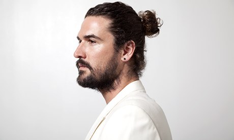


These are a few of the style ideas for the hair of my model. I like them all a lot and i will try them all in my photoshoot.
Tuesday, 26 January 2016
Photo ideas
I am going to have to take my photos again, however these pictures are a rough idea of what sort of photos i want and what i will use for my magazine.
This is the photo that i was planning to use for my front cover. i like the way that he is looking away and you can see his hair style properly. I was going to photoshop him into a cool background possibly chinbrook meadows if i did choose to use this image on my front cover.

This photo i was thinking of using on my double page spread. The background is of all tickets and gigs that my model has been to and includes posters of indie rock artists that he loves. This gives people an insight as to what interests my model has and so putting it on the double page spread would show my readers what my model is about.

This one i would also put on the double page spread or maybe put it on the contents page as a small image. I like this photo because it has a different camera angle and you can see the posters and tickets in the background also.

This photo i was going to use on the double page spread maybe rotated and at the top of the dps. I like the fact that he has the guitar in this picture and it looks as if he is just 'chillin' playing his guitar.

Subscribe to:
Comments (Atom)